6.25.2008

You are here


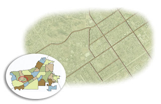
This map turned out to be quite the exercise in assignment interpretation.

Our magazine editor turned to me for what appeared to be a fairly simple map, but he had some very specific styles in mind. I had a clipping indicating what color palette to use, another with a design/format example to follow. Oh yeah, and I had to incorporate a provided map.

OK, it sounds simple enough. But diving into the process, I found early on that I had to be methodical to ensure I nailed all the specs right in Illustrator.

It worked. My only regret is that the process is a little too time-consuming to integrate into our paper. Too bad; the graphics would be a lot cooler. Someday, maybe.

(BTW, there's no labels on this map because I was asked to allow the designer to put them on to maintain consistency with fonts. Which suited me fine since labeling is the worst part of designing maps. So monotonous.)


UPDATE: I actually did figure out a way to integrate this style into our regular graphics for the paper using Google Earth and Photoshop. I honed the process and styles myself for a few months and am now passing off the process to our front-page designers. I'll post a few here sometime.

The Art of Love


Guess what holiday THIS illustration was for?

So we had needed a main image to go with our main Features story, which was sans photo. This actually happens to me a lot. Fortunately, this particular main story was on our Features page, so the illustration wasn't too tough to throw together in Photoshop.

...Takes me back to the days of safety scissors, paste and construction paper — you know, when you actually LIKED Valentine's Day.

Let them eat pie

One of the graphic designers I supervised for a time was constantly giving me grief about the minimal number of colors available for a proper pie chart intended for newsprint.

Minimal colors? Huh? Clearly, she never had box of crayons with more than 16 colors in it. Sad.

Anyway, when this assignment came along, I decided to use it to prove to myself once and for all that she was sorely mistaken. Each of these colors is an exact match for a color in our PC color palette, which means the reproduction is guaranteed to work, and the colors will end up differentiated from one another. It ain't rocket science...

It would have been a complete victory had the final graphic not ended up running in black and white due to technical difficulties. *Sigh*

(Incidentally, this isn't how the the key/chatter appeared in print. The words were added to the page in proper format — and better arrangement — after the chart was imported into our PC design platform.)

Map style 2.0


When I was put in charge of the graphics department, we were stuck in giant rut, and our maps were really, well, flat. We were nudged to try totally different processes, and eventually turned to Google Earth. Now, all our maps start out as Google Earth images.

I keep forgetting to put any of the graphics I do up here. Granted they're not super extensive, but considering that I've come up with the process we use from scratch, I'm kinda proud of myself and think it would be good to sort of document the evolution.

For starters, I give you this monster. It's a map of the Redlands Bicycle Classic route.

This is hardly the first graphic I ever made, but it's the first really BIG graphic I ever made. Granted, the information being presented didn't warrant the size we gave it. But I was asked to create something this size to fill a double-truck spread for one of our commercial publications. So I dove in.

Using Photoshop, I overlaid, detailed and tinted something like 17 Google Earth image downloads to create what you see here. Then, with the two map images in place, I added a headline and some copy with more details about the event. (That last step was done on our PC design platform. I'll post the final page here soon.)

Start to finish, the whole thing was a valuable learning project for me... a bit labor intensive when it didn't need to be, but in the end, it helped me see what is and isn't worth the bother when creating maps.

6.24.2008

A little something I've been working on...


I stumbled onto a family project about a year ago when my parents were visiting. My grandmother was putting together a book of our family's history based mostly on her own memories and a few verifications on the details from those with authority to know better.

At the time I expressed interested, I lacked the materials to accomplish this feat. But with a little help from other family members, I was able to acquire Adobe CS3 and quickly set out to teach myself the ropes. Fortunately, my exposure to a vast array of layout software in my nearly 10 years in newspapers made me a quick study for InDesign. I can see why a lot of designers like it... lots of details within your control — or not, if you set things up right.

So I went about creating styles for the book. Text choices. Layout. Libraries! STYLE SHEETS! (OK, I kinda geeked out about it.)

Admittedly, the layout concept you see here isn't my own. It's an idea one of my editors wanted us to attempt with a prior project — a way of "linking" peripheral information without bogging down the stories. But we could never quite get it to work, mostly because it was hard to get everyone to truly understand the vision. (He got it. I got it. The masses... didn't, quite.) But once I started editing my grandmothers writings, I knew this format would be perfect, allowing for tangents while keeping a relatively straight narrative.

The book is far from finished — heck, these pages aren't even final — and I've been feeling bad about that. I got lost creating blogs, looking for jobs, and, OK, playing Wii and hanging out with my cousins. But I have few new motivators that should put me back on track in no time flat, and I'm excited to get further into the book (there's more pictures available!). Regardless, I've been relieved to discover that I have no trouble jumping back into InDesign. About 10 minutes to reorient myself, and I'm a machine for several hours after that.

Thirty-three days and counting...

6.20.2008

DESiGNER 4 HiRE


WHY HAVEN'T I POSTED THIS ON HERE BEFORE?!

So yeah... this is my resume... enjoy.
(Tell your friends, especially the rich ones.)

The best and worst of times


A friend of mine left journalism a few weeks ago. I made her a little going-away present. We had breaking news that night, so I didn't really get to make a big thing out of it or anything; I just handed it to her, told her I hoped she liked it (she did), and went back to work.

I hate good-byes.

6.19.2008

Proper focus


We were planning a story related to the 2008 Presidential race, but it was more analytical in nature, collecting impressions from our Latino community about their impressions on the race. Initially it began as a piece examining who our local Latinos might favor now that Hillary — who had done a bit better winning over that segment of the traditionally Democratic population — had conceded to Obama. (The initial pitch never mentioned McCain.) So I shopped the wires for Obama art and started designing an Obama centerpiece.

A couple of problems quickly emerged:
1) Too much focus on Obama; not enough balance with McCain.
2) Too much focus on national figures when our current mindset is "Local, Local, Local!"

Time was definitely a factor in that I had none, unless I felt like working a 12+ hour day (I didn't).

My thought was that I could save the package by doing a couple of things:
1) Obscuring the photos, which were, essentially, mugshots.
2) Drawing the readers' attention to the words, more specifically the headlines.

So I did some Photoshopping to make the faces look sculpted rather than photographed — something I only ever just messed around with, never for an assignment intended for print. (I continue to be a bit sheepish with my illustrations, mainly because I haven't had too many of them published. I'm trying my best to change that, but more on that in a later posting.)

I do wish I could have found a photo that night of McCain NOT looking right at the camera, but none of the photos available to me at the time fit that bill.

Nonetheless, overall, I was pretty pleased with the results. Others must have been, too, as I was bracing for a fight from start to finish. But once I explained my reasons, my supervisor was cool with it, and there were no nasty notes from the higher-ups on Monday morning.

Victory.

6.05.2008

Shiny buttons


Lighting and shadows are tricky, but I think I did pretty well getting these buttons to show both in way that is subtle but cool.

Incidentally, I'm not a pothead. In fact, that crap makes me physically ill. These were used as logos for a series of stories stemming from a cluster of marijuana grow-house busts in our coverage area. Just wanted to be clear.