10.30.2008

Trying times


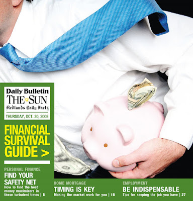
A few weeks ago, I was called on to help coordinate a special section for all of LANG — a Financial Survival Guide. Although it represents some very long hours over relatively few days, I'm very pleased with the results, both in its content and it's look.

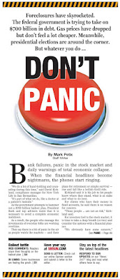
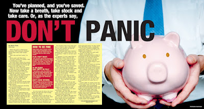
The concept spiraled off of our "DON'T PANIC" centerpiece, hence the tie-in headline on the double-truck. Designed to be solution-oriented, the guide is stacked with Q&As, definitions, tip lists and the like. The goal was to provide quick and immediate answers to a range of economic topics: from banks and the bailouts to navigating the turbulent mortgage climate to taking the temperature of the region's job climate.

The overall look was simple by design. The turn-around on the project itself was a little crazy, but we definitely wanted it out there before Election Day. No cutouts. No type treatments. Just straight-forward styles, a touch of color here and there.

I especially love the cover shot, which came about after handing the piggy bank to a reporter, who happened to have decent looking hands, AND he was wearing a nice shirt and tie. He instinctively held it like a football. We ran with it. (The cover shot we had originally intended ended up as the double-truck, and works nicely there anyway.)

The section appears in today's editions. I hope it will be as well-received by our readers as it has been among our editors and advertisers. And I hope it helps.
10.26.2008

WILL DEZINE 4 GAS MUNNY

October has been rough. This isn't news, but it has been, and it's made for some interesting visual opportunities.

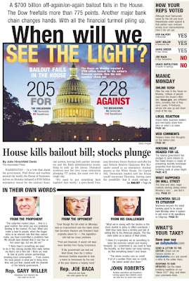
I've taken lead on most of these, running with the assignment of "get all this stuff out there, OK?" which is my cue to figure out how to package all the tidbits of the day's financial happenings and get them ALL represented on the front page... somehow. Save for the "Don't Panic" CP, which is little more than a story treated right. The theme came straight from the editor's mouth himself, and the panic-button-as-main-art idea came from our photo editor. The rest — from intros to rails to spiffy backgrounds — is just me playing Tetris with good material. OK, maybe a little more work than that...


*Note: The bailout vote CP (top right) is a pre-press version. The headline (and likely some other stuff) was changed; I just don't have a PDF of the final cover... yet. I'll be swapping it out for the final version at some point... stay tuned...


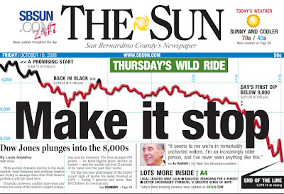
A note about the Dow item: Not a completely original concept, the falling line across the page and behind other elements. I did dress ours up with a cool graph-paper-like background grid that I didn't really see anywhere else, and I also indicated times when the Dow was "in the black" that day. That element proved an interesting adventure in itself as I essentially had to make two graphs, then superimpose pieces of one onto the other. The line element started in Illustrator, but it ended in Photoshop.


SIDE PROJECT: I've also been working on a special section we're calling the Financial Survival Guide. That project has pretty much been a blur from start to finish. Definitely my baby, visually, and a very big learning experience.

More on that later... maybe even the whole enchilada if you're lucky.