7.23.2008

My first commissioned piece


My fee: One iced triple Grande, nonfat latte, please (w/two Equals). THX.

Yes, this illustration was a special request for a couple of coworkers on the desk who are putting together a zine. I've been told I get a credit in the mag, or at least a special thank-you mention. Neat.

AND a latte.

You're welcome. :-)


The first edition on the e-zine "The Dead Protagonists Society" hit my inbox at the beginning of August. I was given permission to put the whole thing here, but couldn't get Blogger to clear a PDF for upload, or Photoshop to separate the cover page out. Unless I'm doing something wrong (always a possibility).

Anyway, if you want to get a look at this publication yourself, you can contact the publication's editors, Amanda Keith and James Zvonec, directly at
deadprotagonists@gmail.com if you'd like to find out more. Or post a request here in the comments, and I'll get it to you myself. Good stuff.

7.17.2008

Taking the plunge


I've been tiptoe-ing into Illustrator for a few months and finally decided it was high time I just go for it. The story, for our Business page, was about a local program that helps first-time home-buyers get the financing they need.

The whole idea for the illustration was mine, concept to execution, and I learned a lot about the Illustrator process with this one. There's certainly room for improvement, but I was pretty pleased with the results here.

Oh, and I'm putting a digital pen at the top of my Christmas list this year. That sure would have made this drawing a lot easier to accomplish.

Trying something new


I wanted to try charcoal sketching, and I thought this assignment would be a perfect fit for that tone.
The story was about layoffs, and I really wanted the image to be a box of stuff that would be on a desk. Initially, I thought this would just be a photo illustration, but our photographers are pretty loaded down with assignments these days, so I thought I'd take a crack at it.

So I picked up a basic charcoal sketching set at the local art store and a watercolor pad (since I thought I might be watercoloring). I was going for a gritty look, but the end result didn't turn out exactly like I was hoping. Probably because I ran out of time and had to do the coloring in Photoshop — not that I had any decent markers anyway ("Dear Santa..."). But it was a valuable learning experience that produced a totally usable image.

If I could go back and start this one over, I might have just done really ragged marker edges to achieve a different take on a "gritty" look. (Next time...) I especially liked adding the details here: the farm picture... days of the week on the calendar...

At the last minute, I added the brown "label" on the front to serve as a background for a breakout of tips that went with the story. Without that bit of color, the words got lost.

Definitely gotta get me some markers...

It's kinda like lip-synching...


So we had a photo of three girls singing in a competition, and a story about a competition these girls were NOT competing in. What to do....? OH YEAH. Turn the photo into a photo illustration for one of our features covers.

This background, a nod to the iPod ads, came together very quickly and was pretty fun working up all those layers. The white lines should have been a little darker; they got a bit lost on the newsprint. Other than that, this was a quick fix that looked like we planned it this way all along.

The smaller, alternate version was cropped for use as a background for a skybox promo on the front page.

7.04.2008

Ready for take-off


I've been suggesting illustrations — especially for our Business centerpieces — for quite awhile already. My only stipulation was that I needed to have ample time to come up with an idea I felt confident about executing. Finally, this week, I got some marching orders.

I'll put more details on the topic later. Just wanted to get this posted.


This illustration finally ran... about three weeks AFTER I stayed late one shift trying to finish it up to run that first weekend. So it goes.

The story was about how some travelers were finding it cheaper to fly out of Mexican airports for their vacations, some reportedly saving upwards of $1,000.

Keeping it all together


While still gathering all the images, I was a little worried I wouldn't be able to fit everything in... especially since I had come up with the "split-screen" concept. Actually, I did have to hold the presidential quotes the reporter dug up (I think it stung a little... he had a soft spot in his heart for Jimmy Carter). Then I realized I had forgotten something BIG. Hadn't figured out where the STORY should go. Yikes.

But I thought I came up with a slick solution, and that the whole package worked... pretty well, actually.

If you play your cards right...


This illustration was for a centerpiece we did about the 2008 California primary election. Getting all the heads' proportions to be similar was a little tricky. Also, unfortunately, the edges of the cards kinda faded out in the toning process so the definition got lost a little.

Not sure what i would have had time to do to fix it though, given I made the whole thing on deadline. Maybe made sure the toning was satisfactory on the mugshots and then NOT toned the final illustration. That might have worked.

Anyway, the headline went on the blank card in front, with heavy Helvetica condensed typography in red and blue. (I'm still looking for the page... hope to post it here soon.)

6.25.2008

You are here


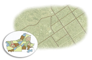
This map turned out to be quite the exercise in assignment interpretation.

Our magazine editor turned to me for what appeared to be a fairly simple map, but he had some very specific styles in mind. I had a clipping indicating what color palette to use, another with a design/format example to follow. Oh yeah, and I had to incorporate a provided map.

OK, it sounds simple enough. But diving into the process, I found early on that I had to be methodical to ensure I nailed all the specs right in Illustrator.

It worked. My only regret is that the process is a little too time-consuming to integrate into our paper. Too bad; the graphics would be a lot cooler. Someday, maybe.

(BTW, there's no labels on this map because I was asked to allow the designer to put them on to maintain consistency with fonts. Which suited me fine since labeling is the worst part of designing maps. So monotonous.)


UPDATE: I actually did figure out a way to integrate this style into our regular graphics for the paper using Google Earth and Photoshop. I honed the process and styles myself for a few months and am now passing off the process to our front-page designers. I'll post a few here sometime.

The Art of Love


Guess what holiday THIS illustration was for?

So we had needed a main image to go with our main Features story, which was sans photo. This actually happens to me a lot. Fortunately, this particular main story was on our Features page, so the illustration wasn't too tough to throw together in Photoshop.

...Takes me back to the days of safety scissors, paste and construction paper — you know, when you actually LIKED Valentine's Day.

Let them eat pie

One of the graphic designers I supervised for a time was constantly giving me grief about the minimal number of colors available for a proper pie chart intended for newsprint.

Minimal colors? Huh? Clearly, she never had box of crayons with more than 16 colors in it. Sad.

Anyway, when this assignment came along, I decided to use it to prove to myself once and for all that she was sorely mistaken. Each of these colors is an exact match for a color in our PC color palette, which means the reproduction is guaranteed to work, and the colors will end up differentiated from one another. It ain't rocket science...

It would have been a complete victory had the final graphic not ended up running in black and white due to technical difficulties. *Sigh*

(Incidentally, this isn't how the the key/chatter appeared in print. The words were added to the page in proper format — and better arrangement — after the chart was imported into our PC design platform.)

Map style 2.0


When I was put in charge of the graphics department, we were stuck in giant rut, and our maps were really, well, flat. We were nudged to try totally different processes, and eventually turned to Google Earth. Now, all our maps start out as Google Earth images.

I keep forgetting to put any of the graphics I do up here. Granted they're not super extensive, but considering that I've come up with the process we use from scratch, I'm kinda proud of myself and think it would be good to sort of document the evolution.

For starters, I give you this monster. It's a map of the Redlands Bicycle Classic route.

This is hardly the first graphic I ever made, but it's the first really BIG graphic I ever made. Granted, the information being presented didn't warrant the size we gave it. But I was asked to create something this size to fill a double-truck spread for one of our commercial publications. So I dove in.

Using Photoshop, I overlaid, detailed and tinted something like 17 Google Earth image downloads to create what you see here. Then, with the two map images in place, I added a headline and some copy with more details about the event. (That last step was done on our PC design platform. I'll post the final page here soon.)

Start to finish, the whole thing was a valuable learning project for me... a bit labor intensive when it didn't need to be, but in the end, it helped me see what is and isn't worth the bother when creating maps.

6.24.2008

A little something I've been working on...


I stumbled onto a family project about a year ago when my parents were visiting. My grandmother was putting together a book of our family's history based mostly on her own memories and a few verifications on the details from those with authority to know better.

At the time I expressed interested, I lacked the materials to accomplish this feat. But with a little help from other family members, I was able to acquire Adobe CS3 and quickly set out to teach myself the ropes. Fortunately, my exposure to a vast array of layout software in my nearly 10 years in newspapers made me a quick study for InDesign. I can see why a lot of designers like it... lots of details within your control — or not, if you set things up right.

So I went about creating styles for the book. Text choices. Layout. Libraries! STYLE SHEETS! (OK, I kinda geeked out about it.)

Admittedly, the layout concept you see here isn't my own. It's an idea one of my editors wanted us to attempt with a prior project — a way of "linking" peripheral information without bogging down the stories. But we could never quite get it to work, mostly because it was hard to get everyone to truly understand the vision. (He got it. I got it. The masses... didn't, quite.) But once I started editing my grandmothers writings, I knew this format would be perfect, allowing for tangents while keeping a relatively straight narrative.

The book is far from finished — heck, these pages aren't even final — and I've been feeling bad about that. I got lost creating blogs, looking for jobs, and, OK, playing Wii and hanging out with my cousins. But I have few new motivators that should put me back on track in no time flat, and I'm excited to get further into the book (there's more pictures available!). Regardless, I've been relieved to discover that I have no trouble jumping back into InDesign. About 10 minutes to reorient myself, and I'm a machine for several hours after that.

Thirty-three days and counting...