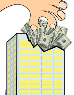
When you don't feel like drawing all that money, I have two words for you: MIXED MEDIA. Kind of a cool effect, I think. Not something I'd try all the time, but I think it helped punch it up a little because otherwise, it's really pretty plain. Which was good this time around because I had very little time to pull this together, despite being given the idea a bit earlier in the week than usual.
Oh, and the hand dipping INTO the money was a happy accident. In my original sketch, the hand kind of hovered above the building (which, for some reason, had a skewed angled roof. Don't ask, 'cause I have no answer). I was stuffing the money into the building and hand turned the hand layer off, for some reason. When I turned the hand back on, it was "in" the money... PERFECT. It just clicked and made the whole thing work a lot better.
SIDENOTE: I like the shadow and proportion work I did on the building. I almost messed up the bigger windows; they were originally going to be half as wide, but then I realized the correct proportions would mean they should be longer than the "squares" on the end, which are "shorter" because of perspective. Yes, occasionally I get it right even on deadline. Go me.
I could have a little better making sure my outline strokes were even throughout. I think I've got three widths up there. A little schizophrenic for whatever reason...
CREDIT WHERE IT'S DUE: Incidentally, this original concept for this illustration again came from the reporter on the story. Kudos to you, man. I don't think I'd ever get these things done if I had to sit there and come up with ideas from scratch. Could be worse, though... could be illustrations about SPORTS topics. That would just be beggin' for trouble. Anyway... thanks again, Matt!


No comments:
Post a Comment