11.27.2008

Shop 'til you drop


No thanks. But I recognize others enjoy this activity, so I felt compelled to punch up this display for our Business page.

It's worth noting that this display was assembled entirely in Unisys Newsroom, for those of you who know what that is. For those who don't, let's just say it's a PC coding-based page-design system very unlike Quark, InDesign or any other such program most designers won't let go of in order to learn how to do good design in a system that maximizes efficiencies.

10.30.2008

Trying times


A few weeks ago, I was called on to help coordinate a special section for all of LANG — a Financial Survival Guide. Although it represents some very long hours over relatively few days, I'm very pleased with the results, both in its content and it's look.

The concept spiraled off of our "DON'T PANIC" centerpiece, hence the tie-in headline on the double-truck. Designed to be solution-oriented, the guide is stacked with Q&As, definitions, tip lists and the like. The goal was to provide quick and immediate answers to a range of economic topics: from banks and the bailouts to navigating the turbulent mortgage climate to taking the temperature of the region's job climate.

The overall look was simple by design. The turn-around on the project itself was a little crazy, but we definitely wanted it out there before Election Day. No cutouts. No type treatments. Just straight-forward styles, a touch of color here and there.

I especially love the cover shot, which came about after handing the piggy bank to a reporter, who happened to have decent looking hands, AND he was wearing a nice shirt and tie. He instinctively held it like a football. We ran with it. (The cover shot we had originally intended ended up as the double-truck, and works nicely there anyway.)

The section appears in today's editions. I hope it will be as well-received by our readers as it has been among our editors and advertisers. And I hope it helps.

10.26.2008

WILL DEZINE 4 GAS MUNNY

October has been rough. This isn't news, but it has been, and it's made for some interesting visual opportunities.

I've taken lead on most of these, running with the assignment of "get all this stuff out there, OK?" which is my cue to figure out how to package all the tidbits of the day's financial happenings and get them ALL represented on the front page... somehow. Save for the "Don't Panic" CP, which is little more than a story treated right. The theme came straight from the editor's mouth himself, and the panic-button-as-main-art idea came from our photo editor. The rest — from intros to rails to spiffy backgrounds — is just me playing Tetris with good material. OK, maybe a little more work than that...


*Note: The bailout vote CP (top right) is a pre-press version. The headline (and likely some other stuff) was changed; I just don't have a PDF of the final cover... yet. I'll be swapping it out for the final version at some point... stay tuned...


A note about the Dow item: Not a completely original concept, the falling line across the page and behind other elements. I did dress ours up with a cool graph-paper-like background grid that I didn't really see anywhere else, and I also indicated times when the Dow was "in the black" that day. That element proved an interesting adventure in itself as I essentially had to make two graphs, then superimpose pieces of one onto the other. The line element started in Illustrator, but it ended in Photoshop.


SIDE PROJECT: I've also been working on a special section we're calling the Financial Survival Guide. That project has pretty much been a blur from start to finish. Definitely my baby, visually, and a very big learning experience.

More on that later... maybe even the whole enchilada if you're lucky.

9.13.2008

Predators, process... and patience


Yay! I went with my gut...


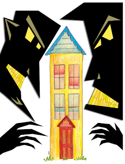
THE HOUSE: It needed to be skinny. Not only to leave room for the predatory monsters, but also because the space on the page for this CP was going to have to be very vertical to fit everything else on. So I did that part first.

The sketching was pretty easy. But time was running short, and once I had the pencil outline, it became very tempting to just follow my cartoony style of outlining and coloring in Photoshop. But I really wanted this one to turn out differently. I had brought my watercolor pencils with me, thinking I would have time to try that technique, if not with the water, then at least with the pencils. But I kept getting interrupted with, you know, MY JOB. Go figure.

After completing a rather unsatisfactory cartoonish outline in Photoshop and realizing I had several hours in front of me getting the monsters in shape anyway... I packed up and went home. Actually, I got the rest of the page ready, measured my allotted space, and then packed up and went home to color.

In favor of keeping the streaks of the color in house, I decided not to water down the house but outline it more heavily instead. The results were not bad for coloring with insufficient light, I think. (The monsters I left for the next morning.)


THE MONSTERS: OK... these look simple, and I guess, in retrospect, they weren't overly complicated to execute. But coming up with just the right sort of look was pretty tricky.

The concept for this illustration was initially a big snake wrapped around a house, but I never intended to draw snake coils, mostly because I thought the house would have to look cinched in the middle in order to make the drawing more effective. So I rethought the concept and thought that creepy hands on either side of the house — giant hands, as big as the house, maybe, to appear closer and help with perspective.


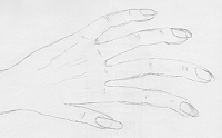
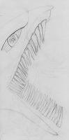
I thought hands would be easy, but I wasn't satisfied with my first effort as I felt they needed more detail to properly counteract the cute-ness of the house. So I tried my "hand" (nar) at the snake, and for some reason kept getting an image of a character I know I've seen before, but just couldn't place. The character was very Maxx-like, for those who remember that MTV cartoon of yore, but a little smaller. Basically, little round black blobs with rows of tightly packed, freakishly long razor-sharp teeth. So I started drawing my "snake," which turned into just a basic reptile sort of being with lots of long, sharp teeth. It did look menacing, but also weird... so... just not quite right.


Then I started getting images from the "Lemony Snicket" movie credit sequence popping into my head for whatever reason. (I hadn't seen or thought about that movie since I saw it on cable probably more than a year ago.) I really loved that style, the heavy black angular figures that looked like they were made of cardstock cut to form appropriate lights and shadows. I also thought this would be an easy fix to my monster problem.


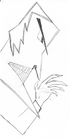
So I made a sketch. There were things I liked about it, but again I stumbled over the hands. The first face was cool, and I knew what modifications I would make during production to make it work. But the hands...! I couldn't decide on proper thumb placement, and even then, the whole thing started to look like less like a sinister figure and more like a villainous Mr. Rogers marionette. *Sigh* ... Plus, I needed TWO faces, and as time wore me down, I figured I would have to simply duplicate and flip the one head to move the process along.

So I fled. Packed up and went home.

I didn't end up scanning in my sketch, but rather used it as a model for what I thought would work or not work. With all the angles involved, there was no real freehand drawing, only polygonal lasso. Felt very much like a project that a grade-school art class might attempt at Halloween... (Oooo — good idea for decorations this year!)

Initially, the monsters were going to be simply black and white, but after I got all their teeth outlined, I really wanted to tint them yellow, so I pulled a few tints from the house. Things went from there...


NITS AND PICKS: So I had some homework, but I think it was worth it. The house isn't perfect, but maybe that adds to its charm. I've considered taking a little water to the original, but I'm not sure yet. Someday, maybe.

Not entirely happy with the hands, which I struggled with from start to finish (as I mentioned above). The one on the right seems too small, given the head on that side is so large, or closer. Maybe I could have flipped the hands, and it would have been fine? Not sure. And I'm really not in the mood to mess with it further. It would just drive me crazy to know something so simple would have made it better. Ignorance is bliss, and all that...

8.22.2008

Cha-ching!


When you don't feel like drawing all that money, I have two words for you: MIXED MEDIA. Kind of a cool effect, I think. Not something I'd try all the time, but I think it helped punch it up a little because otherwise, it's really pretty plain. Which was good this time around because I had very little time to pull this together, despite being given the idea a bit earlier in the week than usual.

Oh, and the hand dipping INTO the money was a happy accident. In my original sketch, the hand kind of hovered above the building (which, for some reason, had a skewed angled roof. Don't ask, 'cause I have no answer). I was stuffing the money into the building and hand turned the hand layer off, for some reason. When I turned the hand back on, it was "in" the money... PERFECT. It just clicked and made the whole thing work a lot better.

SIDENOTE: I like the shadow and proportion work I did on the building. I almost messed up the bigger windows; they were originally going to be half as wide, but then I realized the correct proportions would mean they should be longer than the "squares" on the end, which are "shorter" because of perspective. Yes, occasionally I get it right even on deadline. Go me.

I could have a little better making sure my outline strokes were even throughout. I think I've got three widths up there. A little schizophrenic for whatever reason...

CREDIT WHERE IT'S DUE: Incidentally, this original concept for this illustration again came from the reporter on the story. Kudos to you, man. I don't think I'd ever get these things done if I had to sit there and come up with ideas from scratch. Could be worse, though... could be illustrations about SPORTS topics. That would just be beggin' for trouble. Anyway... thanks again, Matt!

8.21.2008

On cloud... three?

I have a label cloud! NEAT!
(It's on the right, three items down.)

I've wanted one of these since I first laid eyes on one on someone else's blog. Yes, I covet thine Label Cloud. So, in my ongoing efforts to triumph over technology, I did what any respectable geek would do:

I came. I saw. I conquered.
OK, in reality... I Googled. I backed up. I copied, pasted and poked around in the coding.

If I can do it, so can you. Someone else has already done the heavy lifting. (Thanks, Phydeaux3... whoever you are...) It's up to you to break it apart to get it to conform to your own preferences. Oh, and like I mentioned above, don't forget to back up your blog before you go tinkering with all that coding.

Good luck, and have fun!

8.16.2008

Illustration 102: Follow your gut


This is another illustration for a Business story. The original concept was the reporter's idea (thanks, Matt!). His story was about banks having a difficult time after the fall of IndyMac. Lots of banks have been working to distance themselves from the troubled financial pariah.

Shoulda followed my gut and kept it in play, but my day was wearing long at that point. Live and learn. And keep drawing... even if you hate homework.

Upon reflection, I kinda wish I would have done this particular illustration in another medium, like rough sketch, or even given charcoal another go. This subject matter screamed for something grittier than I gave it. But I did learn a lot about Illustrator in the process; mostly that CS3 is far superior to the CS2 version (next time, I'm definitely brining in the laptop... or working from home).

Everything I do starts with a sketch; this time, I just chose the wrong path for that sketch. This looks too clean and tidy for the IndyMac cloud to look very menacing. Maybe I could have held onto the "tidy" banks, but kept the grittier original IndyMac cloud sketch (below) either as is or in charcoal above it.

7.23.2008

My first commissioned piece


My fee: One iced triple Grande, nonfat latte, please (w/two Equals). THX.

Yes, this illustration was a special request for a couple of coworkers on the desk who are putting together a zine. I've been told I get a credit in the mag, or at least a special thank-you mention. Neat.

AND a latte.

You're welcome. :-)


The first edition on the e-zine "The Dead Protagonists Society" hit my inbox at the beginning of August. I was given permission to put the whole thing here, but couldn't get Blogger to clear a PDF for upload, or Photoshop to separate the cover page out. Unless I'm doing something wrong (always a possibility).

Anyway, if you want to get a look at this publication yourself, you can contact the publication's editors, Amanda Keith and James Zvonec, directly at
deadprotagonists@gmail.com if you'd like to find out more. Or post a request here in the comments, and I'll get it to you myself. Good stuff.

7.17.2008

Taking the plunge


I've been tiptoe-ing into Illustrator for a few months and finally decided it was high time I just go for it. The story, for our Business page, was about a local program that helps first-time home-buyers get the financing they need.

The whole idea for the illustration was mine, concept to execution, and I learned a lot about the Illustrator process with this one. There's certainly room for improvement, but I was pretty pleased with the results here.

Oh, and I'm putting a digital pen at the top of my Christmas list this year. That sure would have made this drawing a lot easier to accomplish.

Trying something new


I wanted to try charcoal sketching, and I thought this assignment would be a perfect fit for that tone.
The story was about layoffs, and I really wanted the image to be a box of stuff that would be on a desk. Initially, I thought this would just be a photo illustration, but our photographers are pretty loaded down with assignments these days, so I thought I'd take a crack at it.

So I picked up a basic charcoal sketching set at the local art store and a watercolor pad (since I thought I might be watercoloring). I was going for a gritty look, but the end result didn't turn out exactly like I was hoping. Probably because I ran out of time and had to do the coloring in Photoshop — not that I had any decent markers anyway ("Dear Santa..."). But it was a valuable learning experience that produced a totally usable image.

If I could go back and start this one over, I might have just done really ragged marker edges to achieve a different take on a "gritty" look. (Next time...) I especially liked adding the details here: the farm picture... days of the week on the calendar...

At the last minute, I added the brown "label" on the front to serve as a background for a breakout of tips that went with the story. Without that bit of color, the words got lost.

Definitely gotta get me some markers...

It's kinda like lip-synching...


So we had a photo of three girls singing in a competition, and a story about a competition these girls were NOT competing in. What to do....? OH YEAH. Turn the photo into a photo illustration for one of our features covers.

This background, a nod to the iPod ads, came together very quickly and was pretty fun working up all those layers. The white lines should have been a little darker; they got a bit lost on the newsprint. Other than that, this was a quick fix that looked like we planned it this way all along.

The smaller, alternate version was cropped for use as a background for a skybox promo on the front page.

7.04.2008

Ready for take-off


I've been suggesting illustrations — especially for our Business centerpieces — for quite awhile already. My only stipulation was that I needed to have ample time to come up with an idea I felt confident about executing. Finally, this week, I got some marching orders.

I'll put more details on the topic later. Just wanted to get this posted.


This illustration finally ran... about three weeks AFTER I stayed late one shift trying to finish it up to run that first weekend. So it goes.

The story was about how some travelers were finding it cheaper to fly out of Mexican airports for their vacations, some reportedly saving upwards of $1,000.

Keeping it all together


While still gathering all the images, I was a little worried I wouldn't be able to fit everything in... especially since I had come up with the "split-screen" concept. Actually, I did have to hold the presidential quotes the reporter dug up (I think it stung a little... he had a soft spot in his heart for Jimmy Carter). Then I realized I had forgotten something BIG. Hadn't figured out where the STORY should go. Yikes.

But I thought I came up with a slick solution, and that the whole package worked... pretty well, actually.

If you play your cards right...


This illustration was for a centerpiece we did about the 2008 California primary election. Getting all the heads' proportions to be similar was a little tricky. Also, unfortunately, the edges of the cards kinda faded out in the toning process so the definition got lost a little.

Not sure what i would have had time to do to fix it though, given I made the whole thing on deadline. Maybe made sure the toning was satisfactory on the mugshots and then NOT toned the final illustration. That might have worked.

Anyway, the headline went on the blank card in front, with heavy Helvetica condensed typography in red and blue. (I'm still looking for the page... hope to post it here soon.)

6.25.2008

You are here


This map turned out to be quite the exercise in assignment interpretation.

Our magazine editor turned to me for what appeared to be a fairly simple map, but he had some very specific styles in mind. I had a clipping indicating what color palette to use, another with a design/format example to follow. Oh yeah, and I had to incorporate a provided map.

OK, it sounds simple enough. But diving into the process, I found early on that I had to be methodical to ensure I nailed all the specs right in Illustrator.

It worked. My only regret is that the process is a little too time-consuming to integrate into our paper. Too bad; the graphics would be a lot cooler. Someday, maybe.

(BTW, there's no labels on this map because I was asked to allow the designer to put them on to maintain consistency with fonts. Which suited me fine since labeling is the worst part of designing maps. So monotonous.)


UPDATE: I actually did figure out a way to integrate this style into our regular graphics for the paper using Google Earth and Photoshop. I honed the process and styles myself for a few months and am now passing off the process to our front-page designers. I'll post a few here sometime.

The Art of Love


Guess what holiday THIS illustration was for?

So we had needed a main image to go with our main Features story, which was sans photo. This actually happens to me a lot. Fortunately, this particular main story was on our Features page, so the illustration wasn't too tough to throw together in Photoshop.

...Takes me back to the days of safety scissors, paste and construction paper — you know, when you actually LIKED Valentine's Day.

Let them eat pie

One of the graphic designers I supervised for a time was constantly giving me grief about the minimal number of colors available for a proper pie chart intended for newsprint.

Minimal colors? Huh? Clearly, she never had box of crayons with more than 16 colors in it. Sad.

Anyway, when this assignment came along, I decided to use it to prove to myself once and for all that she was sorely mistaken. Each of these colors is an exact match for a color in our PC color palette, which means the reproduction is guaranteed to work, and the colors will end up differentiated from one another. It ain't rocket science...

It would have been a complete victory had the final graphic not ended up running in black and white due to technical difficulties. *Sigh*

(Incidentally, this isn't how the the key/chatter appeared in print. The words were added to the page in proper format — and better arrangement — after the chart was imported into our PC design platform.)

Map style 2.0


When I was put in charge of the graphics department, we were stuck in giant rut, and our maps were really, well, flat. We were nudged to try totally different processes, and eventually turned to Google Earth. Now, all our maps start out as Google Earth images.

I keep forgetting to put any of the graphics I do up here. Granted they're not super extensive, but considering that I've come up with the process we use from scratch, I'm kinda proud of myself and think it would be good to sort of document the evolution.

For starters, I give you this monster. It's a map of the Redlands Bicycle Classic route.

This is hardly the first graphic I ever made, but it's the first really BIG graphic I ever made. Granted, the information being presented didn't warrant the size we gave it. But I was asked to create something this size to fill a double-truck spread for one of our commercial publications. So I dove in.

Using Photoshop, I overlaid, detailed and tinted something like 17 Google Earth image downloads to create what you see here. Then, with the two map images in place, I added a headline and some copy with more details about the event. (That last step was done on our PC design platform. I'll post the final page here soon.)

Start to finish, the whole thing was a valuable learning project for me... a bit labor intensive when it didn't need to be, but in the end, it helped me see what is and isn't worth the bother when creating maps.

6.24.2008

A little something I've been working on...


I stumbled onto a family project about a year ago when my parents were visiting. My grandmother was putting together a book of our family's history based mostly on her own memories and a few verifications on the details from those with authority to know better.

At the time I expressed interested, I lacked the materials to accomplish this feat. But with a little help from other family members, I was able to acquire Adobe CS3 and quickly set out to teach myself the ropes. Fortunately, my exposure to a vast array of layout software in my nearly 10 years in newspapers made me a quick study for InDesign. I can see why a lot of designers like it... lots of details within your control — or not, if you set things up right.

So I went about creating styles for the book. Text choices. Layout. Libraries! STYLE SHEETS! (OK, I kinda geeked out about it.)

Admittedly, the layout concept you see here isn't my own. It's an idea one of my editors wanted us to attempt with a prior project — a way of "linking" peripheral information without bogging down the stories. But we could never quite get it to work, mostly because it was hard to get everyone to truly understand the vision. (He got it. I got it. The masses... didn't, quite.) But once I started editing my grandmothers writings, I knew this format would be perfect, allowing for tangents while keeping a relatively straight narrative.

The book is far from finished — heck, these pages aren't even final — and I've been feeling bad about that. I got lost creating blogs, looking for jobs, and, OK, playing Wii and hanging out with my cousins. But I have few new motivators that should put me back on track in no time flat, and I'm excited to get further into the book (there's more pictures available!). Regardless, I've been relieved to discover that I have no trouble jumping back into InDesign. About 10 minutes to reorient myself, and I'm a machine for several hours after that.

Thirty-three days and counting...

6.20.2008

DESiGNER 4 HiRE


WHY HAVEN'T I POSTED THIS ON HERE BEFORE?!

So yeah... this is my resume... enjoy.
(Tell your friends, especially the rich ones.)

The best and worst of times


A friend of mine left journalism a few weeks ago. I made her a little going-away present. We had breaking news that night, so I didn't really get to make a big thing out of it or anything; I just handed it to her, told her I hoped she liked it (she did), and went back to work.

I hate good-byes.

6.19.2008

Proper focus


We were planning a story related to the 2008 Presidential race, but it was more analytical in nature, collecting impressions from our Latino community about their impressions on the race. Initially it began as a piece examining who our local Latinos might favor now that Hillary — who had done a bit better winning over that segment of the traditionally Democratic population — had conceded to Obama. (The initial pitch never mentioned McCain.) So I shopped the wires for Obama art and started designing an Obama centerpiece.

A couple of problems quickly emerged:
1) Too much focus on Obama; not enough balance with McCain.
2) Too much focus on national figures when our current mindset is "Local, Local, Local!"

Time was definitely a factor in that I had none, unless I felt like working a 12+ hour day (I didn't).

My thought was that I could save the package by doing a couple of things:
1) Obscuring the photos, which were, essentially, mugshots.
2) Drawing the readers' attention to the words, more specifically the headlines.

So I did some Photoshopping to make the faces look sculpted rather than photographed — something I only ever just messed around with, never for an assignment intended for print. (I continue to be a bit sheepish with my illustrations, mainly because I haven't had too many of them published. I'm trying my best to change that, but more on that in a later posting.)

I do wish I could have found a photo that night of McCain NOT looking right at the camera, but none of the photos available to me at the time fit that bill.

Nonetheless, overall, I was pretty pleased with the results. Others must have been, too, as I was bracing for a fight from start to finish. But once I explained my reasons, my supervisor was cool with it, and there were no nasty notes from the higher-ups on Monday morning.

Victory.

6.05.2008

Shiny buttons


Lighting and shadows are tricky, but I think I did pretty well getting these buttons to show both in way that is subtle but cool.

Incidentally, I'm not a pothead. In fact, that crap makes me physically ill. These were used as logos for a series of stories stemming from a cluster of marijuana grow-house busts in our coverage area. Just wanted to be clear.

5.20.2008

Lost in translation

This entry has been moved here. Thanks for reading.

4.21.2008

Skyboxes of yore


I miss doing skyboxes.

Of course, when I HAD to do them, they were the bain of my existence. Not because I didn't enjoy them, but because I never had enough time to make them truly cool. And when I did create the time, the rest of my page suffered.

That might be why I made this page to start with: to keep all the good stuff in one place. And to preserve the times I was able to make that 2-inch strip truly mine.

Sketch Logos


I helped with the concept of these lists, so I volunteered to do the illustrations to help them pop.

The pictures were pretty simple — doodles really. Nevertheless, I was pretty proud of my first published drawings (look, Mom!), especially given that most of them came together a few hours before publication.

More fun with type


This was a web logo I threw together for one of our reviewer blogs. I came across the treble clef that was the color you see now, and while I was trying to figure out what color I might change it to, it occurred to me that the shape kinda looked like an "S," which is conveniently found in the word "music." Add some color splash, and voila. Logo.

p.s. - I'm not sure why the orange is blowing out here... it's been fine everywhere else I've seen it. Blah.

Typographical logos


I developed this shadow/mixed-typography/striping style for some new features at the paper as they came up. They didn't go over too well at my SND portfolio review, but you know what? I like them. And so do my editors.

Not shown here is a logo for The Bizz. It was kinda like The Buzz... only with an "i," of course. Oh, and it was green, like money, since it was a Business feature. Get it? Good.

Allrightythen.