
I abandoned this blog a long time ago, but I was curious to see how an entry to a blog linked to my G+ account would behave on said social media.
Here goes nothing...
2.11.2009
'The Hoppening'
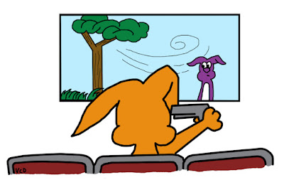
Last summer, after a very interesting night at the movies with two of my cousins, I submitted this illustration in answer to a job post on the Killer Bunnies web site looking for a "bunny artist." Never heard back from them, but I've always thought my idea would have made a neat new card for the game, and I was pretty pleased with myself at having mimicked their style so well.
So, I've finally decided to post it here along with the letter. Neither seemed to do any good for me anyplace else.
Enjoy.
—
GREETINGS KILLER BUNNY GENIUSES.
A cousin of mine introduced our extended family to Killer Bunnies and the Quest for the Magic Carrot at a reunion in Nebraska a few years ago. We were instantly hooked (you had me at Green Gelatin with Evil Pineapple Chunks) and played a giant throwdown match every night of the reunion, with some of us obtaining our own Killer Bunny decks shortly thereafter.
I would love the chance to become one of you. Ecstatic to find a job listing on your web site a few days ago, I worked through the night tonight developing an idea I had at work yesterday.
Please find my drawing for "The Hoppening" — which I envision as a RUN or a SPECIAL card — attached to this e-mail. The description I had in mind goes something like this: Kills all of one player's bunnies, but does so one round at a time. (They cannot be saved; however, other players may contribute or speed up the offing by providing weaponry, which cannot be spread past this player.) Adjacent players have until that player's last bunny is dead to reduce their bunnies by half or their bunnies suffer the same fate, and so on.
I have a few other ideas that I haven't been able to fully develop or sketch out yet, but hopefully this gives you an idea of my abilities and enthusiasm for your product. If you would like to know more about me or discuss my ideas further, feel free to reply to this e-mail or call the number below. Thank you for your time and consideration.
— Gina Dvorak
(blah blah blah... contact info...)

2.08.2009
Celebrating black history

"Can we make a collage to use for the Perspectives page CP this weekend?" a hopeful pair of opinion editors each asked me separately on Tuesday. "No problem. Get me a list..." I responded both times.
I always think those things are going to be easy. Slap some photos onto other photos. Voila! Instant centerpiece.
Of course, now that the whole thing is behind me, I can think of at least three ways I could have done it "simpler." A bunch of stacked black-and-photos with IDs in red boxes on top of them, a la Vanity Fair and the like. A checkerboard of photo/ID pairs. A combination of the two ... sorta.
But you know, when you're on your 13th consecutive hour at the office — and even the morning after a semi-decent night's sleep after said long work day — it can be difficult to see your way out of the tunnel you created for yourself at the beginning of the project.
So I ended up with this collage. I, personally, like the glowing red super-hero-esque Muhammed Ali. I'm sure others will wonder what I was thinking. I tried turning him other colors, especially after I put a stylized photo of Rosa Parks, in her red shirt, very nearby. But he just didn't look quite so magnificent unless he was red.
And why is Frederick Douglass blue, you might wonder? Well, you'd be a little sad, too, if you were dead before it was cool to be black. ... Did I go too far? Forgive me. I tend to get punchy after a few very long days jammed between some less-than-appealing hour-long-plus commutes in the rain.
In hindsight, since I had to rap up quick and things weren't ending exactly right, I really should have had the desk tone the thing b/w. It probably would have been better, and I wouldn't have to explain why I made Ali the ani-Hulk. Grrrr.

Original phots from Getty Images, wire services, and web
Bottom row, from left: Rosa Parks, Muhammed Ali and Richard Pryor. Middle row: Malcolm X and Martin Luther King Jr. Back row: George Washington Carver, President Barrack Obama, Harriet Tubman, Frederick Douglass (in blue) and Ruby Bridges (in white).
—
Follow-up note: No one gave me even an ounce of flack for the red Ali. As a matter of fact, I got quite a few compliments on the illustration. I guess you just never can tell what's going to strike people as odd — or not.
2.07.2009
Buried treasure

Deep in "the closet" of my hard drive, I found this gem. It's a web banner that is still used at the top of a coworker's blog about movies (recent and not, mainstream and less-than), and even some "Battlestar Gallactica" postings.
Granted, there's a few things I would have done a little differently with the banner, and I definitely wish I could have redone it or helped with the color swatching when they widened the format, but given that I made this banner when my knowledge of Photoshop was still a bit on the beginners' side of the fence, I'm pretty happy that I still like it.
The coworker must have liked it all right as well; she and another coworker later sought me out to do illustrations for their e-zine, "The Dead Protagonists Society."
1.05.2009
Already retro

I'm not sure why I never posted this logo on my blog before, but it's already outdated. We recently abandoned it as we took the first steps towards our pending redesign. Still, I liked it, back in "the day," like... a whole year and a half ago.
I remember being particularly proud of figuring out how to create the stamp-like look to the 24-7. It was also my first experience with a "commissioned" logo. Sort of. Being for work, I didn't really make any extra money on the deal, but I did have to please "the customer." I had to use a specific color palette and it was requested that the "24/7" part "look like a stamp."
In other words, I let the web guy boss me around until he was satisfied... which was just par for the course with him anyway. Good times.
A healthy start

We recently launched a weekly health-focus page called HealthBeat, which required a couple logos to get started. These weren't created totally on the fly, but close enough. I think I might have had two whole days to work on them, which is fine. They're fairly simplistic and get the point across, and the typography establishes a theme we can easily build on as we add new features.
11.27.2008
Shop 'til you drop

No thanks. But I recognize others enjoy this activity, so I felt compelled to punch up this display for our Business page.
It's worth noting that this display was assembled entirely in Unisys Newsroom, for those of you who know what that is. For those who don't, let's just say it's a PC coding-based page-design system very unlike Quark, InDesign or any other such program most designers won't let go of in order to learn how to do good design in a system that maximizes efficiencies.
10.30.2008
Trying times

A few weeks ago, I was called on to help coordinate a special section for all of LANG — a Financial Survival Guide. Although it represents some very long hours over relatively few days, I'm very pleased with the results, both in its content and it's look.
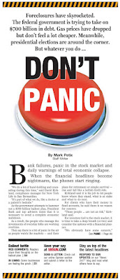
The concept spiraled off of our "DON'T PANIC" centerpiece, hence the tie-in headline on the double-truck. Designed to be solution-oriented, the guide is stacked with Q&As, definitions, tip lists and the like. The goal was to provide quick and immediate answers to a range of economic topics: from banks and the bailouts to navigating the turbulent mortgage climate to taking the temperature of the region's job climate.
The overall look was simple by design. The turn-around on the project itself was a little crazy, but we definitely wanted it out there before Election Day. No cutouts. No type treatments. Just straight-forward styles, a touch of color here and there.
I especially love the cover shot, which came about after handing the piggy bank to a reporter, who happened to have decent looking hands, AND he was wearing a nice shirt and tie. He instinctively held it like a football. We ran with it. (The cover shot we had originally intended ended up as the double-truck, and works nicely there anyway.)
The section appears in today's editions. I hope it will be as well-received by our readers as it has been among our editors and advertisers. And I hope it helps.

10.26.2008
WILL DEZINE 4 GAS MUNNY
October has been rough. This isn't news, but it has been, and it's made for some interesting visual opportunities.
I've taken lead on most of these, running with the assignment of "get all this stuff out there, OK?" which is my cue to figure out how to package all the tidbits of the day's financial happenings and get them ALL represented on the front page... somehow. Save for the "Don't Panic" CP, which is little more than a story treated right. The theme came straight from the editor's mouth himself, and the panic-button-as-main-art idea came from our photo editor. The rest — from intros to rails to spiffy backgrounds — is just me playing Tetris with good material. OK, maybe a little more work than that...
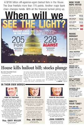
*Note: The bailout vote CP (top right) is a pre-press version. The headline (and likely some other stuff) was changed; I just don't have a PDF of the final cover... yet. I'll be swapping it out for the final version at some point... stay tuned...
—
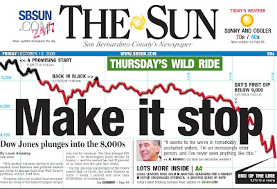
A note about the Dow item: Not a completely original concept, the falling line across the page and behind other elements. I did dress ours up with a cool graph-paper-like background grid that I didn't really see anywhere else, and I also indicated times when the Dow was "in the black" that day. That element proved an interesting adventure in itself as I essentially had to make two graphs, then superimpose pieces of one onto the other. The line element started in Illustrator, but it ended in Photoshop.
—
SIDE PROJECT: I've also been working on a special section we're calling the Financial Survival Guide. That project has pretty much been a blur from start to finish. Definitely my baby, visually, and a very big learning experience.
More on that later... maybe even the whole enchilada if you're lucky.
I've taken lead on most of these, running with the assignment of "get all this stuff out there, OK?" which is my cue to figure out how to package all the tidbits of the day's financial happenings and get them ALL represented on the front page... somehow. Save for the "Don't Panic" CP, which is little more than a story treated right. The theme came straight from the editor's mouth himself, and the panic-button-as-main-art idea came from our photo editor. The rest — from intros to rails to spiffy backgrounds — is just me playing Tetris with good material. OK, maybe a little more work than that...


*Note: The bailout vote CP (top right) is a pre-press version. The headline (and likely some other stuff) was changed; I just don't have a PDF of the final cover... yet. I'll be swapping it out for the final version at some point... stay tuned...
—
A note about the Dow item: Not a completely original concept, the falling line across the page and behind other elements. I did dress ours up with a cool graph-paper-like background grid that I didn't really see anywhere else, and I also indicated times when the Dow was "in the black" that day. That element proved an interesting adventure in itself as I essentially had to make two graphs, then superimpose pieces of one onto the other. The line element started in Illustrator, but it ended in Photoshop.
—
SIDE PROJECT: I've also been working on a special section we're calling the Financial Survival Guide. That project has pretty much been a blur from start to finish. Definitely my baby, visually, and a very big learning experience.
More on that later... maybe even the whole enchilada if you're lucky.
9.13.2008
Predators, process... and patience

Yay! I went with my gut...
—
THE HOUSE: It needed to be skinny. Not only to leave room for the predatory monsters, but also because the space on the page for this CP was going to have to be very vertical to fit everything else on. So I did that part first.
The sketching was pretty easy. But time was running short, and once I had the pencil outline, it became very tempting to just follow my cartoony style of outlining and coloring in Photoshop. But I really wanted this one to turn out differently. I had brought my watercolor pencils with me, thinking I would have time to try that technique, if not with the water, then at least with the pencils. But I kept getting interrupted with, you know, MY JOB. Go figure.
After completing a rather unsatisfactory cartoonish outline in Photoshop and realizing I had several hours in front of me getting the monsters in shape anyway... I packed up and went home. Actually, I got the rest of the page ready, measured my allotted space, and then packed up and went home to color.
In favor of keeping the streaks of the color in house, I decided not to water down the house but outline it more heavily instead. The results were not bad for coloring with insufficient light, I think. (The monsters I left for the next morning.)
THE MONSTERS: OK... these look simple, and I guess, in retrospect, they weren't overly complicated to execute. But coming up with just the right sort of look was pretty tricky.
The concept for this illustration was initially a big snake wrapped around a house, but I never intended to draw snake coils, mostly because I thought the house would have to look cinched in the middle in order to make the drawing more effective. So I rethought the concept and thought that creepy hands on either side of the house — giant hands, as big as the house, maybe, to appear closer and help with perspective.

I thought hands would be easy, but I wasn't satisfied with my first effort as I felt they needed more detail to properly counteract the cute-ness of the house. So I tried my "hand" (nar) at the snake, and for some reason kept getting an image of a character I know I've seen before, but just couldn't place. The character was very Maxx-like, for those who remember that MTV cartoon of yore, but a little smaller. Basically, little round black blobs with rows of tightly packed, freakishly long razor-sharp teeth. So I started drawing my "snake," which turned into just a basic reptile sort of being with lots of long, sharp teeth. It did look menacing, but also weird... so... just not quite right.

Then I started getting images from the "Lemony Snicket" movie credit sequence popping into my head for whatever reason. (I hadn't seen or thought about that movie since I saw it on cable probably more than a year ago.) I really loved that style, the heavy black angular figures that looked like they were made of cardstock cut to form appropriate lights and shadows. I also thought this would be an easy fix to my monster problem.

So I made a sketch. There were things I liked about it, but again I stumbled over the hands. The first face was cool, and I knew what modifications I would make during production to make it work. But the hands...! I couldn't decide on proper thumb placement, and even then, the whole thing started to look like less like a sinister figure and more like a villainous Mr. Rogers marionette. *Sigh* ... Plus, I needed TWO faces, and as time wore me down, I figured I would have to simply duplicate and flip the one head to move the process along.
So I fled. Packed up and went home.
I didn't end up scanning in my sketch, but rather used it as a model for what I thought would work or not work. With all the angles involved, there was no real freehand drawing, only polygonal lasso. Felt very much like a project that a grade-school art class might attempt at Halloween... (Oooo — good idea for decorations this year!)
Initially, the monsters were going to be simply black and white, but after I got all their teeth outlined, I really wanted to tint them yellow, so I pulled a few tints from the house. Things went from there...
NITS AND PICKS: So I had some homework, but I think it was worth it. The house isn't perfect, but maybe that adds to its charm. I've considered taking a little water to the original, but I'm not sure yet. Someday, maybe.
Not entirely happy with the hands, which I struggled with from start to finish (as I mentioned above). The one on the right seems too small, given the head on that side is so large, or closer. Maybe I could have flipped the hands, and it would have been fine? Not sure. And I'm really not in the mood to mess with it further. It would just drive me crazy to know something so simple would have made it better. Ignorance is bliss, and all that...
8.22.2008
Cha-ching!

When you don't feel like drawing all that money, I have two words for you: MIXED MEDIA. Kind of a cool effect, I think. Not something I'd try all the time, but I think it helped punch it up a little because otherwise, it's really pretty plain. Which was good this time around because I had very little time to pull this together, despite being given the idea a bit earlier in the week than usual.
Oh, and the hand dipping INTO the money was a happy accident. In my original sketch, the hand kind of hovered above the building (which, for some reason, had a skewed angled roof. Don't ask, 'cause I have no answer). I was stuffing the money into the building and hand turned the hand layer off, for some reason. When I turned the hand back on, it was "in" the money... PERFECT. It just clicked and made the whole thing work a lot better.
SIDENOTE: I like the shadow and proportion work I did on the building. I almost messed up the bigger windows; they were originally going to be half as wide, but then I realized the correct proportions would mean they should be longer than the "squares" on the end, which are "shorter" because of perspective. Yes, occasionally I get it right even on deadline. Go me.
I could have a little better making sure my outline strokes were even throughout. I think I've got three widths up there. A little schizophrenic for whatever reason...
CREDIT WHERE IT'S DUE: Incidentally, this original concept for this illustration again came from the reporter on the story. Kudos to you, man. I don't think I'd ever get these things done if I had to sit there and come up with ideas from scratch. Could be worse, though... could be illustrations about SPORTS topics. That would just be beggin' for trouble. Anyway... thanks again, Matt!
8.21.2008
On cloud... three?
I have a label cloud! NEAT!
(It's on the right, three items down.)
I've wanted one of these since I first laid eyes on one on someone else's blog. Yes, I covet thine Label Cloud. So, in my ongoing efforts to triumph over technology, I did what any respectable geek would do:
I came. I saw. I conquered.
OK, in reality... I Googled. I backed up. I copied, pasted and poked around in the coding.
If I can do it, so can you. Someone else has already done the heavy lifting. (Thanks, Phydeaux3... whoever you are...) It's up to you to break it apart to get it to conform to your own preferences. Oh, and like I mentioned above, don't forget to back up your blog before you go tinkering with all that coding.
Good luck, and have fun!
Subscribe to:
Posts (Atom)

